

Paul Miller
Interior Designer Through millwork and masonry, furnishings and finishes, lighting and leaps of faith, MakeNest Interiors transforms spaces with thoughtful decisions based on core design principles. In our ‘Why We Did That’ series, we take you behind our recommendations.

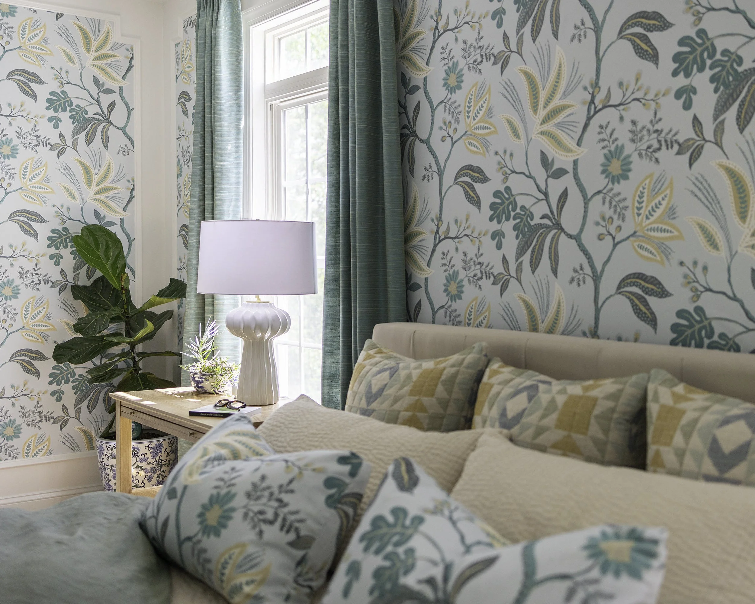
For this Why We Did That, we return to Nest #601 for a regency-inspired redesign of a plain Jane owner suite. This space was a story yet to be written, its blankness most evident in the bedroom, where character was in short supply. Other than a pair of windows overlooking the (beautiful, sloping) lawn and a (frankly dumpy) corner fireplace, the space was dominated by large, featureless planes.
Together, our softly expressive wallcovering and restrained faux wainscoting, like any well-matched pair, have greater impact together than apart. The millwork lends the walls rhythmic repetition and the pattern on the paper gives organic, flowing lines in a wash of restful colors.

The drapery in the space was selected to bring out the rich, deep teal in the wallpaper, which appears again in tile at the hearth and in the owner bathroom. A quilted geometric pattern in bed pillows and ottoman play to the colors on the walls, while adding a note of casual, cozy modernism. Nightstands and a dresser from one of our favorite local makers were made with a sandy finish on ash wood to further establish a relaxed and fresh take on classic style.
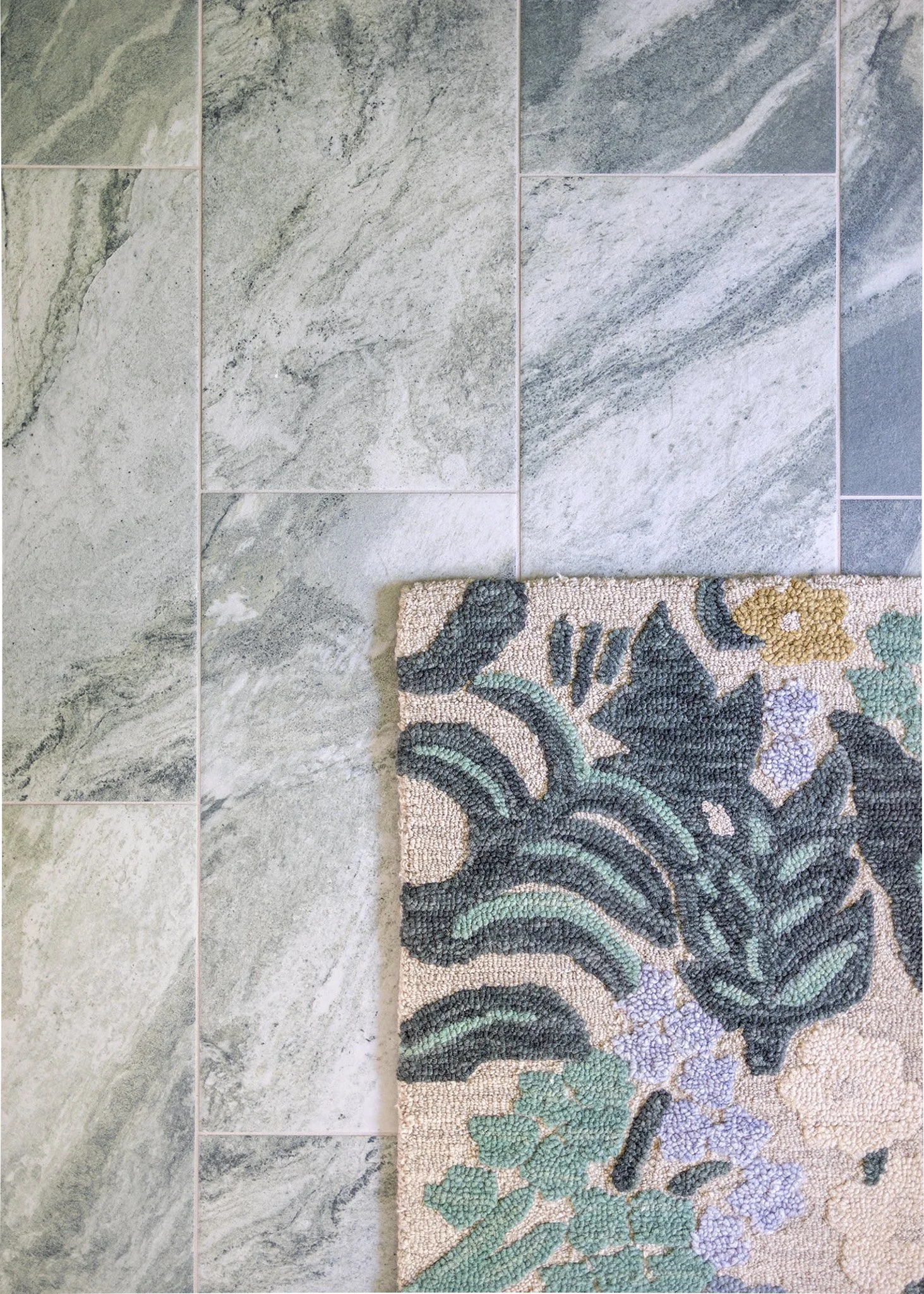
The fireplace as we found it was more a thumbnail sketch than an architectural feature. It was also clearly a holdover from the era of deep television sets. Still, the placement invited a seating grouping well out of the way of daily traffic flow and the scale and functionality of the insert was not in need of reinvention. Removing the inexplicable header and filling in the void above, our craftsmen added new millwork and tile in soft green, evocative of Edwardian color schemes.

This corner of the room is warmed year round by the yellow and ivory buffalo check we selected for the the chair and the playful graphic textile on the ottoman. These colors marry beautifully with art our client brought from her California home, and which we reframed in a light, walnut-toned frame. The art continues the eclectic mix of new and old influences.


The owner suite bath was not so much a blank page as one that needed a heavy edit. The shower was so closed off as to feel cave-like and the platform tub was cumbersome and heavy. Rethinking these elements breathes light and air into the space. The vanities, which were solidly built in cherry wood, needed only a new, painted finish and fresh hardware, the latter in brushed brass to compliment other new fittings in the space. Fabric that matches the bedroom wallpaper is repeated on a functioning roman shade over the tub for privacy and light control. The green tiles from the shower accent wall are used again on the bedroom hearth, providing continuity, and applied in a different orientation for variety.

Vanity sconces with Art Nouveau influences and mirrors in curvy, antiqued frames lend grace notes and that hint of historic style to the otherwise fresh and modern space. New, heated floors in pumice and spruce green tile ground the room in earthy comfort.

The story this suite tells is one of soft, relaxing luxury, where rhythm, harmony, and balance have filled the old, blank pages with a fresh, timeless poetry for the senses. It is wonderful when a bedroom suite can take you away, transform your mood and inspire pleasure.
After Photos: Matthew Lofton
Before


Before Photos, Zillow

A designer’s every choice is intentional, mindful of scale and proportion, rhythm and harmony, contrast and texture. Our ‘Why We Did That’ series is a bite-sized dive into one-off changes, big and small, that are part of our home transformations.
Interested in learning how we can bring change to your nest? Give our studio a call at 540-336-3385 or hit the button below to tell us more about your project.