< Projects

About This Design
Interior Design: Paul Miller
Our client wanted her house to evoke a place that she had loved for a long time: the set of Nancy Meyers’ 2003 film ‘Somethings Gotta Give’. As many designers will attest, this early aughts interior continues to inspire clients. When I revisited the film, I saw that the bones of the beloved set are still very much relevant and desirable. I decided on a design with (mostly) soft colors, punctuated with jolts of blue, and grounded with handsome millwork details like vertical tongue and groove walls in both family room and kitchen.
As with any project that starts with a subject of inspiration, my goal was to capture the feeling of the fictional house without crafting a carbon copy of it. Unlike the character played by Diane Keaton, my client is very much a real person, with her own cherished collection and interests.

I had two important architectural goals in mind for the the family room. One was to define a warmer, more human-scaled ceiling height (or perception of this), which was achieved by running a cove molding with dust cap from the lowest, rear wall to the face of the catwalk. The other important change was updating the hearth, which was clad in shallow stone veneer that read as heavy, off-scale and dated. Handsome board trimmings in Benjamin Moore’s Oxford White and scalloped blue tile transform the hearth beautifully.
Airy sheers render a glowing light and slender brass sconces offer understated, modern luxury. Custom sofas and pillows reflect colors from the kitchen backsplash tile: topaz, gold and blue.


In the kitchen, I recommended keeping most of the solid wood cabinetry, updating the look with new doors, finishes and hardware. The layout was functional and the cabinets well-made, making this sustainability choice a no-brainer. Changing four of the doors to seeded glass fronts helped break the longest run of upper cabinets, adding both display and added visual depth.
A defunct microwave-vent combo was jettisoned in favor of a custom-built hood and the gas stove was replaced with an induction cooktop. The cabinetry is painted in Benjamin Moore’s warm, neutral River Gorge Gray. New Carrara Breve countertops and printed backsplash tiles further lighten up the room while adding color and character.


The kitchen peninsula received more custom tongue and groove, proving a clean backdrop for a run of rustic counter stools in black iron and cerused oak. To provide the room with a pantry, I had our carpenter turn the foyer closet around 180 degrees. The loss of the coat closet in the entry was remedied by making room for a wardrobe in a small front living room that is now reimagined as a high style cloak room (see below).


In the dining room, new wainscoting trim below the chair rail adds an elegant backdrop to an eclectic design inspired by my client’s rustic dining table and vibrant blue chairs. The china hutch was painted dark brown to ground the room and invoke the look of an older and more storied piece. Drapery in a joyful print melds colors together and references the relaxed character of the table. Preppy plaid wallpaper offers a contrast to the modern brass and milk glass sconces and chandelier with stringed shade.


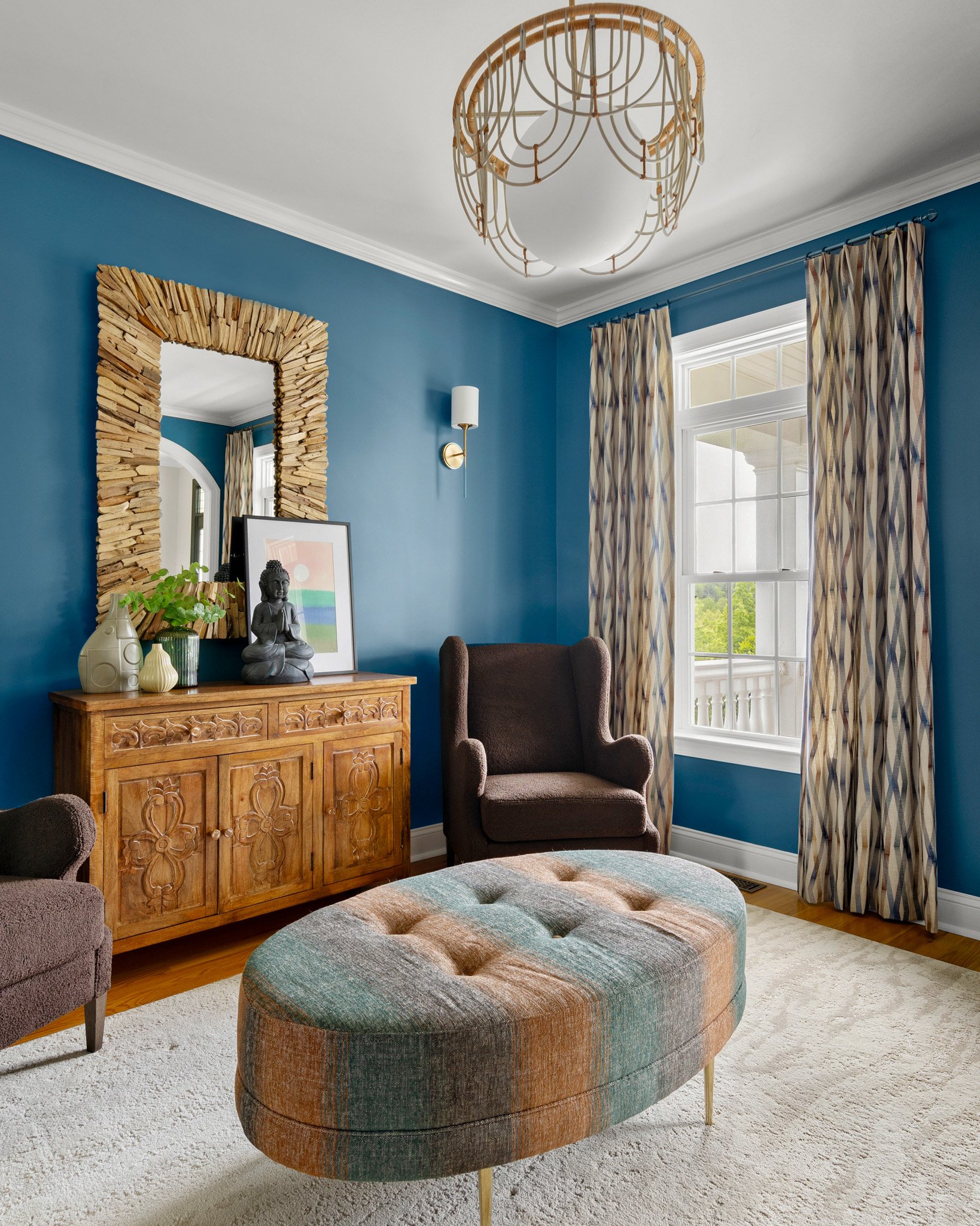
The cloak room, mentioned above, makes a nice sitting area for two, adjacent to both the foyer and the main level owner suite. As a cloak room sounds to me quite swanky, I wanted to make this room the darkest and most dramatic of all, which was not hard to arrive at with Benjamin Moore’s Santa Monica Blue. The wall color is a fantastic foil for my client’s honey-toned carved chest and for embroidered drapery that introduces shades of topaz and rust also present in the brass-legged custom ottoman. A modern light fixture in milk glass and two-toned bent wood lends the room a bit of funk, while curvy chairs in chocolate brown boucle invite one to relax for a while after shrugging out of their wraps.


The powder room was transformed with a new vanity and fittings, mirror and light fixture. The most dramatic element of the design, however, is the wallpaper mural, which takes one to another story altogether, that of the Pevensie children. Lions and owls and peacocks peer out from lush trees while the sconce hangs above all like the legendary lamppost in the C. S. Lewis series. Given that my client is an avid reader with professional ties to high level library operations, I knew that she would enjoy this fantastical treatment.
This luxury renovation began with a clear point of inspiration and blossomed into its own breathtaking and comfortable haven. We will be sharing more of this home later this year as we highlight the owner suite and home office as part of our ‘Why We Did That’ series.
Photos: Matthew Lofton


