Nest #226

Photo: Matthew Lofton

About This Design

Interior Design: Paul Miller

Is it possible to fall in love with your home all over again after more than twenty years? My clients at Nest #226 were ready for a change, but after so long it was hard to see the forest for the trees. To make this project a success, it would require us to peel away the past, find and improve the bones of the house, and introduce the best our makers and craftsmen have to offer. And it would demand openness and faith from our clients.

From day one, my clients were open to my recommendations and, as they floated ideas of their own, our collaboration resulted in game changing decisions, like heightening the doorways in the living and dining rooms and removing the higher bar counter in the kitchen. What buoyed the design throughout was my clients’ hunger for change. It was time for new colors, lighting, treatments, and furnishing, as well as select architectural improvements.

The transformation is stunning and the collaboration was a delight.

Photo: Matthew Lofton

The kitchen has a unique layout and one that my clients enjoy for its compact footprint. As someone who functions best in smaller workspaces, I understood that the kitchen was not in need of a complete overhaul. The existing cabinets were of extremely high quality and had the inset doors and drawers that have become more and more prized over the years. Working with our painter, we covered over the cherry wood, choosing Ben Moore’s lush Rosepine for the main work hub and calming, airy Alaskan Skies for two walls of pantry cabinets not shown and for the beadboard on the outside of the peninsula.

Photo: Matthew Lofton

For the countertops, we switched from a dark, muddy granite to Clarino Brushed, a quartz product that I selected for of its warm, toasty shades and soft, leathered finish. Because we stayed with the beautiful, hand-made terracotta floor tiles, it was important to me that those earthy, golden brown hues be referenced in the counters. A new light fixture over the sink and knobs on the cabinets in brushed, antique brass were a perfect fit for this design.

Photo: Matthew Lofton


Photo: Matthew Lofton

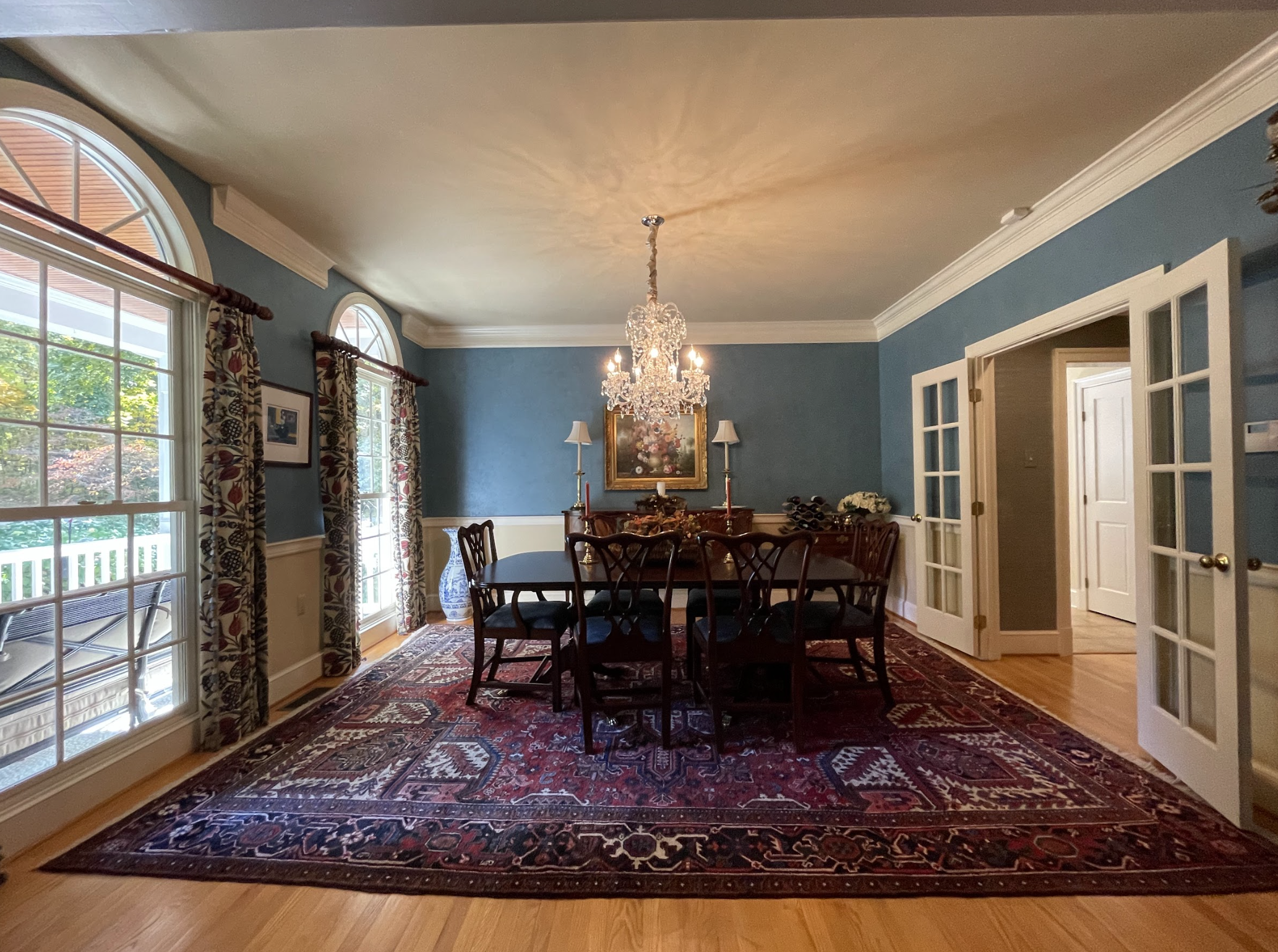
In the dining room, as well as the living room directly across from it, classic Oriental carpets were beautiful but heavy, so we changed out the floor coverings for serged wool with a tweedy weave. New sculpted velvet fabric on the dining chairs further brightens and modernizes the room. Window treatments in both rooms had been mounted level with the base of the palladium transoms, cutting the vertical height and creating an awkward, squatty architectural appearance. Given the privacy of the house and the shade provided by a gracious front porch, I recommended doing away with the drapery altogether and lightening up the wall color to decrease the contrast with the trim color. This allows the eye to glide gracefully over the spaces. We took away a chair rail to further uplift the room.

Photo: Matthew Lofton

In the dining room, we added contemporary light sconces to flank the sideboard, providing stylistic contrast with the traditional furnishings. I felt that we should keep the original, crystal chandelier, as its light, magical presence in the space felt right. A new painting featuring vibrant, joyful colors heightens the eclectic elegance of the space. In the living room, we repurposed the beautiful fabric that had been on the dining room windows to reupholster a chair and ottoman that have nice details and are an ideal scale for the room.


Photo: Matthew Lofton

New lamps in red and a tuxedo-armed sofa in gentle blue introduce cleaner silhouettes and fresh textures, while drawing color from the freshly reinterpreted lounge chair. Unlike many formal living rooms, this one gets frequent use, as one of my clients is a pianist. Fittingly, the baby grand is a finely and completely restored antique with a rich, mellow tone.

My concept for the front hall, living, and dining rooms was for them to be treated as one large salon, so all three spaces share the same wall and ceiling colors, Ben Moore’s Chatsworth Cream and Bella Blue respectively. This concept is what prompted my client to ask about raising the headers on the doorways to ensure that the repetition of the blue ceiling was visible within each of the spaces. The modification works perfectly to heighten drama and continuity.


In the hearth room, we completed refaced the hearth. The tray ceiling in this room did not give enough vertical height to accommodate a niche that had been in the original brick. New stone and an altered treatment to the face of the firebox give the hearth earthier style and a more comforting weight in the room. An original painting by Theodor Seuss Geisel inspired the colors in the mitered seam ottoman and the custom green chest. Comfortable sofas in user-friendly performance fabric invite family and friends to come right in and get comfortable. Our painter applied Chatsworth Cream to grasscloth in this room and the texture and dimension casues the room to read as a half-shade deeper than the adjacent foyer and dining and living rooms.

Photo: Matthew Lofton

Photo: Matthew Lofton

Photo: Matthew Lofton

In the hearth room, we simplified the floor covering, using a rust and ivory wool in a playful micro-trellis weave. Art over the custom green console was commissioned by a Virginia-based artist and reflects colors that play throughout the home: gold, green, teal, and rose. A sleek, sensuous new lamp strikingly fills the intentional void in the art placement. Throughout the home, leaves and other botanical forms emerge in art and textiles, reflective of the lush surroundings gardens created by Barrett’s Horticulture.


Attention to details, willingness to edit, and openness to a whole new vision all played a role in helping this project blossom into a full-fledged transformation. Each of the rooms we were commissioned to reimagine are a reflection of my belief that proportion, scale, texture, and rhythm are essential for a pleasing aesthetic. The art and textiles work together with fluid grace while drawing the eye around the spaces to ensure that no lovely feature is overlooked.


Before


Nest #801

Photo: MakeNest Interiors

About This Design

Interior Design: Paul Miller

Wise men say only fools rush in, so as with all of our projects, we approached this refresh thoughtfully, using a light touch to transform two truly used spaces without displacing cherished family heirlooms or the homeowner’s playful sense of style. This is an historic home with beautiful bones that does not take itself too seriously.

Lived in and loved for years by the same family, many of the home’s mysteries have been solved. The best arrangement for a sofa in the sun room was figured out long before we arrived. The same could be said for the most suitable scale of table and chairs in the equally sun-dappled kitchen eating area.

Here our design was as interpretive as ever, but it was less a complete overhaul and more like that old game Operation: we took out, replaced, and reworked only what was essential to ensure beauty, comfort, and fresh energy for years to come, always mindful that the house’s well-established personality was not lost.

Photo: MakeNest Interiors

In the kitchen eating area, reupholstered lounge chairs, a new rug, and fresh paint create a vibrant atmosphere right at home with a loved and careworn antique table and handsome set of Windsor chairs. The graphic pattern and abundant colors of the rug speak to our client’s love of folk art and history, bringing to mind lovingly pieced quilts that place an array of colors together in one vibrant, energizing universe.

Photo: MakeNest Interiors

Warm, tweedy performance fabric in shades of blue and aqua give a pair of vintage lounge chairs a sporty, relaxed appearance while ensuring that kitchen spills are not a worry. We had our workroom alter the skirt on these chairs slightly, removing a few extra pleats that pinned their style to a more formal era. The beauty of working with local artisans is that small adjustments with big impacts are as easy as a sketch and a conversation.

Photo: MakeNest Interiors


A creative project space for visiting grandchildren; home office; television viewing area; and relaxing place to put up weary feet at the end of the day, the sunroom in this home is the hub of daily life and a fierce workhorse. Our goal was to provide new upholstery and a rework of existing pieces, as well as a new rug and lighting, and a refresh on paint colors.

Photo: MakeNest Interiors

This room had been traditionally dressed with fabrics in shades of ruddy duck blue. With notes of green in the adjacent living room, we shifted the color ever so slightly on new and reupholstered pieces alike, opting for hues of sea glass that offer a more intuitive flow. Here the textiles and new rug produce a milder backdrop that allows the eye to travel outward to the garden and to come to rest on shelves packed with books, photos, and other treasures picked up along the way.

Photo: MakeNest Interiors

Photo: MakeNest Interiors

New lamps on beautifully patinaed existing tables were chosen for their vintage flair. The incised leaf pattern and sandy color bring to mind a stylish, 1950s Miami chic that feels right at home in a room where Elvis memorabilia and gardening books speak to some of our client’s many passions.

Photo: MakeNest Interiors

This project is a perfect study in finding the balance between a total overhaul and a light-handed refresh. The result is rooms we can’t help falling in love with.


Before


Nest #115

About This Design

Interior Design: Paul Miller

Venice and turtles. It’s funny the elements of a home a designer calls upon for inspiration. In this project, photos of travel and a collection of our shell dwelling friends influenced choices in color, texture, and additional art.

But first we studied how to use the rooms. The room directly off the front entry could have been furnished as a dining room or a sitting area, even having been outfitted with a chandelier by the previous owner. The large kitchen and great room area in the rear of the house also had space for a table and chairs.

A study of layout options led us to recommend that the primary functions of food prep, shared meals, and relaxation around a fire should happen in the back of the home, offering an opportunity to create a cozy lounge up front for getting away to read and talk and to warmly greet company.

In the front space, we established a grounding focal point with a striking gallery wall of crisp, geographically diverse photography and nature-oriented images. Our selections were chosen to round out the story that existing art already told - of travel, faith, and love of nature. A modest church in a grassy meadow reflects iconography elsewhere in the home, while the coral walls of a building in Spain evoke the timeless lure of travel.

These art choices were the inspiration for the colorful, folkish drapery fabric in the sitting room. Lamps with amorphous, craggy bases in an earthy golden finish bring to mind the silhouette of an ancient tortoise shell. A mirror carved and painted with mermaid-like scales in the foyer evokes a sense of seaward wanderlust.

In this space blue takes the lead, supported by shades of green, rust, and gold. Aqua stain over petrified wood gives the appearance of Caribbean waters to a pair of nesting tables in the sitting area, while velvet pillows printed with aquatic blooms explode with joyful color. The woven seagrass shade on the pendant light seems plucked right from the ocean floor.


In the great room, color is used more sparingly, honoring a custom kitchen in white and soft grey, but still we carry shades of blue, green, and rust throughout. Those hues show up in art, drapery, pillows, and a vintage-inspired vinyl floor cloth in the eating area, a practical, wipeable surface for everyday use. A custom ash dining table was crafted to perfectly fit the space and the open design of the updated Windsor chairs allows the gaze to pass through the dining space to appreciate the adjacent areas.

The design woven into the drapery fabric in the living area has an erased quality that gives the treatments the charm of age, while the textile’s shades of blue and green reflect colors in the foyer mirror and elsewhere.

A drink table crafted in hand-chiseled wood offers more of the dense texture we were mindful to introduce throughout the house. The vibrant rust-toned velvet on the hearthside chair, repeated in sofa pillows, pulls similarly warm hues from art throughout the home. A designer knows when to drop punctuations of color into a space to create an aesthetic rhythm that is friendly to the senses and draws attention to a room’s strongest points.

A pair of ceramic lamps, incised with a repeating pattern of diagonal lines, adds an earthy whimsy to the room, while carrying notes of grey from the kitchen and repeating forms found in the drapery fabric. Hand-planed ash wood in a rich brown finish warms the custom hexagonal cocktail table, a dramatic, yet light centerpiece to the sitting room. The light, wool rug and Revolution sofa fabric are woven from washable, livable fibers that allow for an airy look and beloved family pets to coexist.

Inspiration can come from anywhere, although the more connected to the interests and experiences of our clients, the more genuine and rewarding the design outcomes. The art of supporting existing elements with the overall design is in being subtle and not literal in the interpretation. Not every thread connecting choices should be detected, but when each piece is built on something solid and meaningful, it is felt by family and guests alike.


Before