< Projects

About This Design
Interior Design: Paul Miller
“I don’t want it to look like everybody else’s home,” our client told me on the first visit. The floor plan is not uncommon in her neighborhood, but one look at her unique art and furnishings added to my confidence that we could create a one-of-a-kind atmosphere in this lovely Frederick County house. A lifetime of putting her own talent for design to work had created a striking and sophisticated collection, but my client sought my help to edit, expand, and interpret for an open floor plan with riches of natural light. The floor plan was a sticking point as well as a color palette from the previous owner that left her cold. Also on that first visit, my client fanned out a portion of a paint color deck, ranging from yellows to greens, and told me she really liked those colors. As I saw a lot of those shades in much of the art, it was natural to explore that palette.
Nowhere more than in the home office do my earthy, elegant colors shine. Shades of spruce green and autumnal gold are the foundation of colors throughout the house. The wall color in the office is Benjamin Moore’s delicious Verdigris. The window treatment carries this hue in rouched velvet appliqué, the design of which reflects the geometric dynamism of the Greek Key-inspired doors on the chest. A pair of rock crystal sconces frame the desk in light and lend the space a magical essence.

Photo: Matthew Lofton
One aspect of this home is a pair of pass-throughs that connect office to great room. With no definitive place to stop and start wall color (I really dislike changing wall color at an outside, drywall corner), it was clear that trim would be a great solution to define the spaces. Not satisfied to simply copy the treatment of trim on other interior openings, I designed a style of molding that expands at the corners with a silhouette evocative of a Victorian rosette, but more streamlined and graceful. We liked the idea so much, we had our carpenter repeat the treatment on the doorway of this room, leading to the main hall. Just like that, the office had an elegant feature that exists in no other home in the community. It is best seen in the long shot of the great room below.


Photo: Matthew Lofton
In the great room, I developed a floor plan with asymmetrical balance that honors inherent architectural imbalances, such as the fenestration of windows on the television wall. A pair of new sofas define the seating area, but avoiding the typical choice of bringing each of the sofas close to a single cocktail table allows the arrangement to be open and inviting. Peppercorn-black pillows embroidered with threads of copper and gold relate the existing charcoal slipper chairs to the palette and add sophisticated, global style. New lamps with textural, black and gold bases heighten the glamour, while two cool seats with a bold, abstract design serve up slivers of chartreuse to enliven the palette.

Photo: Matthew Lofton
New and old pair seamlessly in this space for updated style that honors the pieces that have come with her through many chapters of my client’s life.
In the dining room a soft, refined velour on the chair seats and new host chairs ties into the spruce green of the office walls and living room accent pillows. We repeated the same modern, textural rug in dining and great rooms for a light-handed, unifying result. As with every space in this home, I was able to work with my client’s art collection, curating and hanging pieces in new combinations to bring a fresh perspective to cherished pieces. The streamlined chandelier offers up modern elegance to contrast with the more traditional silhouettes of the furnishings.

Photo: Matthew Lofton
As I noted before, this house has phenomenal natural light. This play of highlight and shadow during our photoshoot is no exaggeration of the sunshine that warms these spaces. Before we changed the colors, the walls were a fleshy, drab hue, not quite grey. Using Benjamin Moore’s Antique Parchment allowed me to lighten the great room and common areas without sacrificing warmth and depth of tone. Another way to reinforce the beauty of generous natural light is to capture it. In the dining room, the chandelier’s textured and prismatic glass holds and refracts light in a way that heightens its presence in the house.

Photo: Matthew Lofton
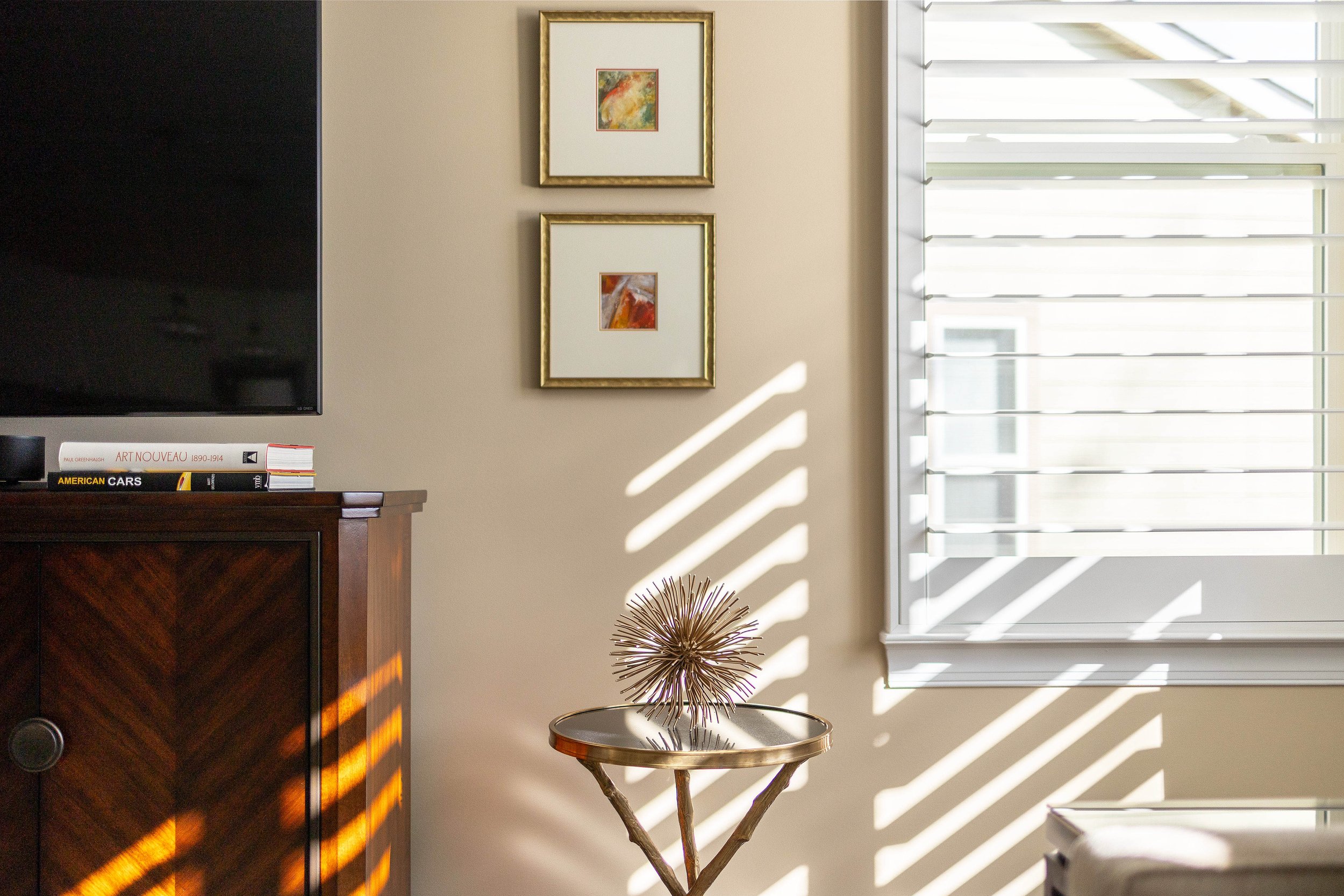
Photo: Matthew Lofton

Photo: Matthew Lofton
In the owner suite, I chose a wallpaper with rhythmic lines and a striated, blue spruce field for the wall above the bed. I implement accent walls very sparingly, as they can be confusing or distracting if improperly chosen. This wall is visible from the public spaces, so I felt there was an opportunity to heighten our use of blue to blue-green hues for continuity. Also the bedroom furnishings, with their rich finish and Art Deco influences, cried out for a glamorous backdrop. Velvet euro shams reflect the wallpaper color. Accent pillows embroidered and printed with petals in shades of birch and pewter lend the space a dreamy, naturalistic elegance.
Throughout the process, my client’s excellent communication style, humor, talent, and desire to see transformation helped ensure the stunning results of this project. Together, we created rooms that are joyful, honest, and fearless and, in doing so, a home that is unique and personal.


