
By Paul Miller
Interior Designer
Read Time: 4 Minutes

I would be lying if I said that some recent design trends don’t bore me - particularly rooms that offer no diversity of color or striking graphic elements. Maybe this is because I cut my teeth on floral prints and plaids. Or because a designer first inspired by Dorothy Draper is probably not going to feel satisfied with a white-on-white room.
In my house, visual stimulation is important and for me that means a trove of unique art, myriad colors, and so many details there is always something new to see. Also important to me and my husband is honoring our experiences and our history through the treasures we’ve picked up along the way. For design inspiration, we might pluck color from a primitive yellow and green pie safe or from a jade, orange, and crimson mid-century oil painting. Did I mention we love color?
I love how a striking object can become the inspiration for all the colors in the room. But there is another way to make that distinctive choice that becomes the springboard for a vibrant and joyful palette: one great fabric can make everything else come together. Whether it is going to be the inspiration for a host of colors or support an array of textures (hopefully both) this fabric better be up for the job, meaning it should be gutsy and complex. I call these unifiers ‘hero fabrics’ and a great one offers a lot of options to choose from, regardless of its style. Think of a hero fabric as an artist’s palette. I’m always excited to get to work with one.
Here are some of my favorite hero fabrics right now.
Whirlwind
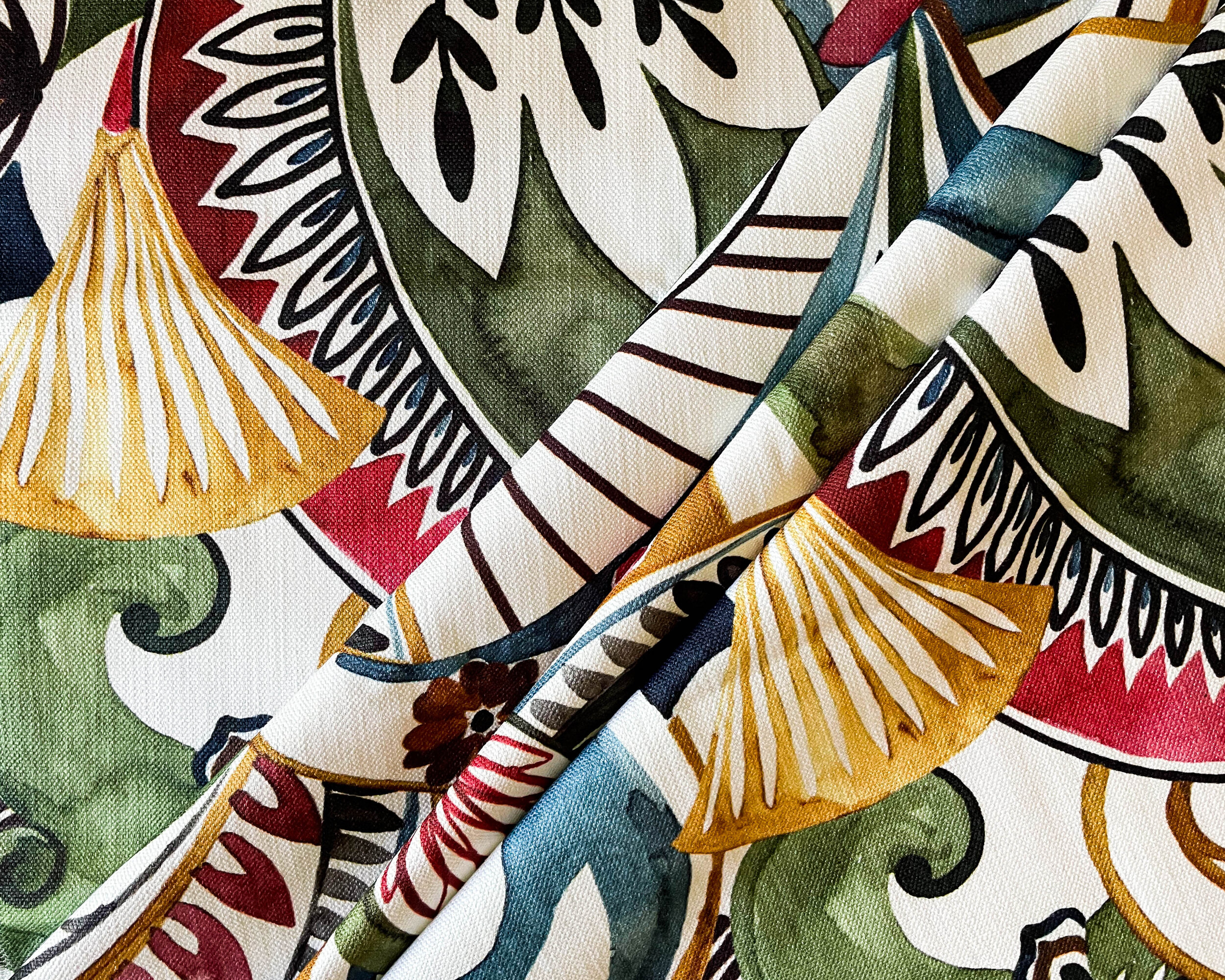
This lyrical print offers a range of colors to pull from, including plum, gold, moss, raspberry, and denim. At once elegant and playful, this print appeals to me as a designer because it has big impact but avoids being easily classified. There are aspects to the art style that evoke both the Art Deco and Art Nouveau traditions, but with a freedom and informality that would make it just as at home in a sunroom as in a dining or guest room. The large scale and lightweight cotton weave would make beautiful pillows, drapery, or bedding, so it would not be hard to imagine how one might center this in a thoughtful design.
Stripe Up the band

These three stripes would make such a great resource for color in a design. Here we see a woolen weave with excellent clarity of color; a velvet that offers a range of highlights and shadows; and a grainy woven with the relaxed charm of an old picnic blanket. I love these stripes because they are each a beautiful balance of moody, darker tones and brighter, saturated ones. Even in the subtlest of the bunch, there are clear and fresh colors. I love a good stripe on a chair or mitered on an ottoman. When using stripes in drapery, I typically prefer to run them horizontally to make sure that no color is ever lost in the folds. Stripes never go out of style and, if anything, they are a marker of tastes, connoting by the precision of their weave whether home fashions are trending formal or casual and by their colors, what tones are in demand with designers.
Unabashed Koi

There is so much to love about this print, not least of all the subject matter and the unapologetic colors. Awash in an array of dark to light values in each hue, this print would make blending other fabrics a joy. And the choices for wall colors it inspires are as varied as the life in a pond. I appreciate a fabric that evokes a sense of place or that tells a story. This one makes me think of some of the most peaceful gardens I have ever visited. There is a glamour to something that commits to its nature. This fabric is lush and languid, begging to be gazed on and enjoyed. In truth, I could imagine how just a few large pillows in this could be added to an otherwise white-on-white design, along with a great ceiling color, to create an unforgettable chic transformation.
Global Appeal

This large-scaled abstract has ikat influences and a range of natural tone - the perfect fabric to ground a room without clipping its wings. It is not every day that a fabric introduces gentle blue, gritty charcoal, dark mustard, and a range of mushroom colors. That combination of both warm and cool hues makes it a very flexible, earthy palette. While it is understandable to imagine a fabric like this as pillows, it would be oh-so-satisfying to instead go the distance and cover an entire chair or sofa in something this gutsy and dynamic. Cotton weaves are very durable and with such a landscape of tones, I imagine this print would hide a lot of daily wear. Sometimes categorized as tribal or global, patterns such as this one are heavily influenced by stylized and abstracted forms found in indigenous art. The presence of this fabric in a space helps paint a picture of a traveled homeowner who has lived interesting experiences. The look is both ancient and modern all at once, making it a statement that never goes out of style.
Light As A Feather

Let’s go out on a light note. Here is a print with a gentle touch, made special because the palette offers subtleties that add mood and interest to a subject matter that might be too sweet in the hands of a less talented graphic designer. I love how the murky, mysterious shades of grey and green throw the brighter raspberry and sea glass colors into fresh, exultant relief. A rusty gold flower here and there adds autumnal warmth, while inky black outlines remind the viewer of the artist’s hand, giving the print a relaxed, sketchbook style both immediate and nostalgic. Some of my earliest clients were graceful older ladies and this print makes me think of those fussy southern guest rooms where one fabric is all the things: draperies, spreads, and shams. Yet there is something to this print that lends itself to the very now Grandmillennial trend. The lightness of the overall effect, that creamy backdrop, seems to invite a design that wants color but without a heavy hand.
So many elements can inspire the palette of a design: art, rugs, even the view or setting. I am drawn to any element that invites more color into a home. Mixing pattern, color, and texture is a really important skill that designers use to center their creations. Hero fabrics - those multi-toned unifiers - can be formal or casual, nostalgic or modern. The great thing is that there are artists and mills in constant collaboration, creating fresh designs to support a variety of design choices. Cheers to creatives everywhere.
Want to have a conversation about how we can create your own colorful design transformation? Feel free to reach out to us or fill out the survey below.