

Paul Miller
Interior Designer Through millwork and masonry, furnishings and finishes, lighting and leaps of faith, MakeNest Interiors transforms spaces with thoughtful decisions based on core design principles. In our ‘Why We Did That’ series, we take you behind our recommendations.

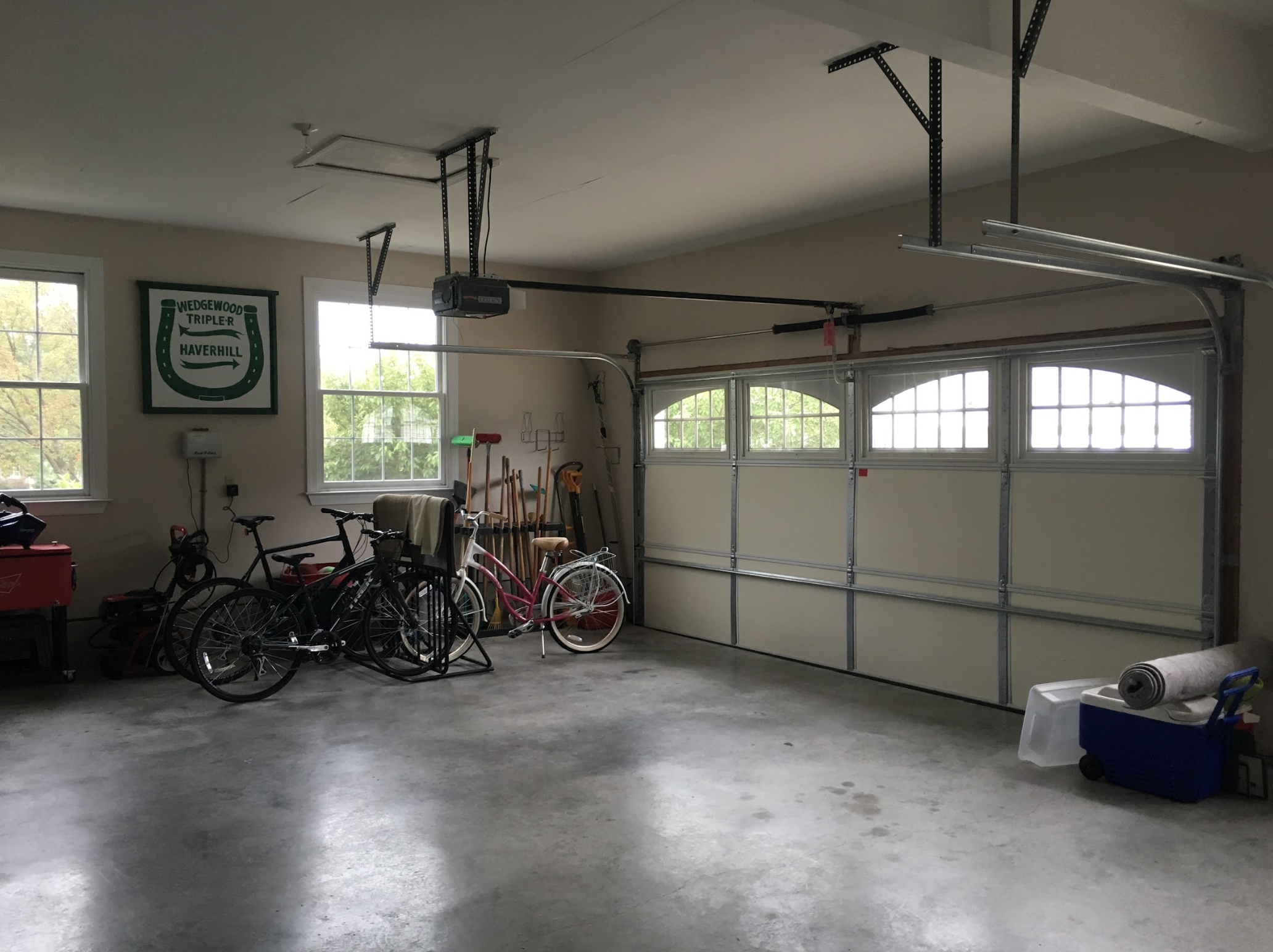
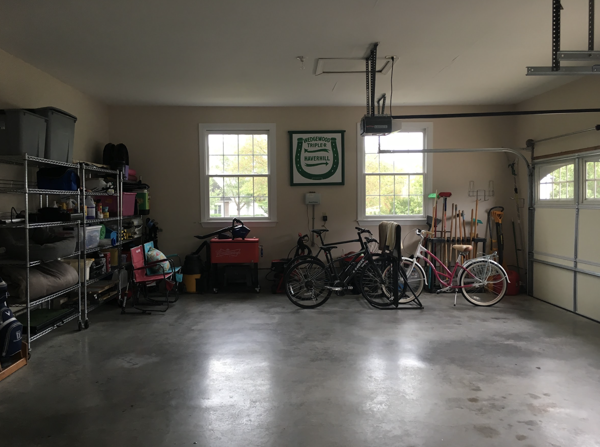
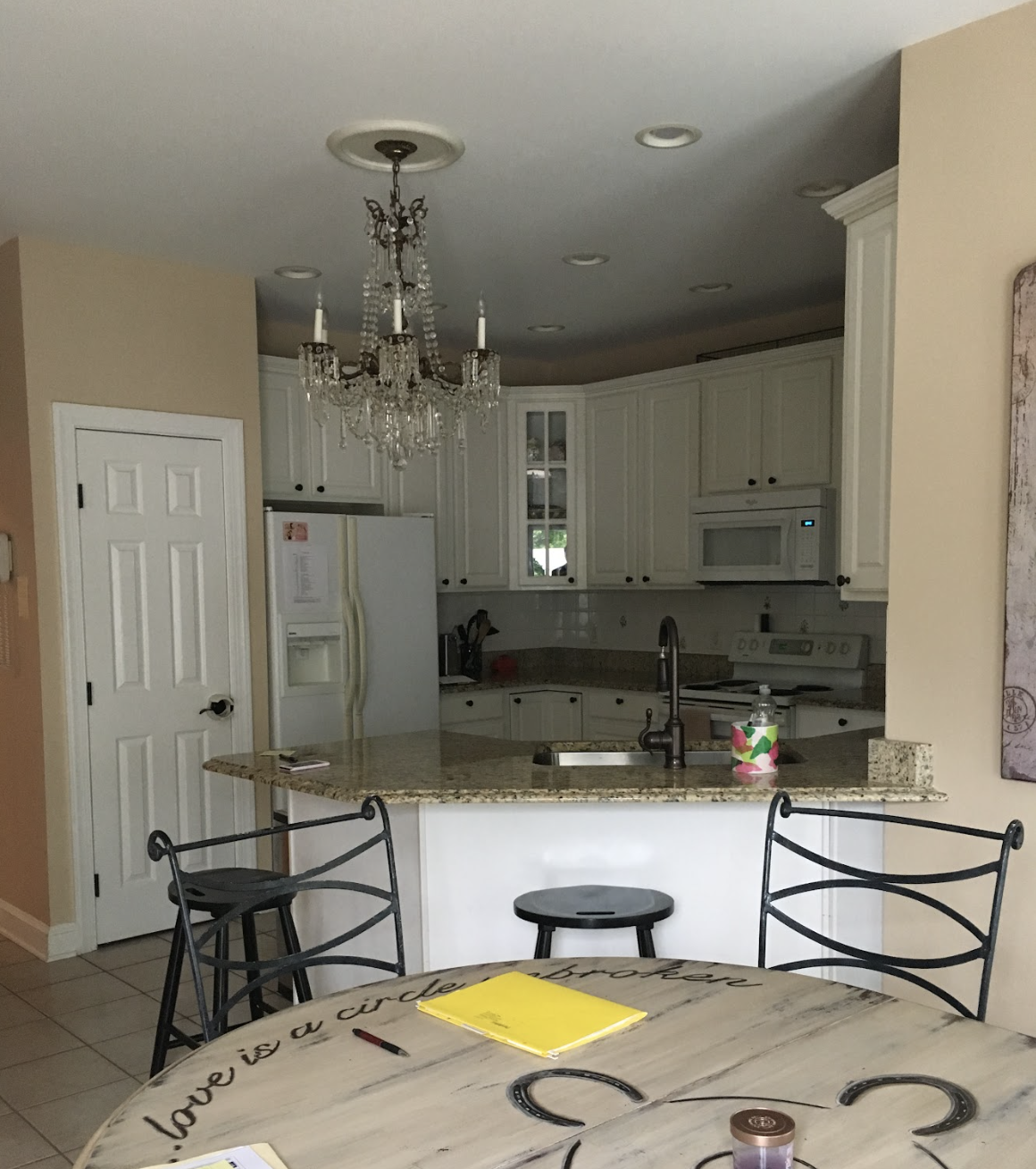
This was not a conventional remodel. At Nest #105, I was transforming a two-car garage into a living room large enough for a growing family. The last thing my client or I wanted was for there to be even a hint of the inherent starkness of its past utility. In the kitchen renovation in the same house, which I undertook before this, I recommended soft shades of blue and an array or light, neutral tones to create a welcoming, modern design.
This design had the gift of a north star, a point of inspiration for me and my client that guided every decision. This compass was the farm that once belonged to my client’s family and which meant so much to her, an endless source of fond nostalgia. In this installment of Why We Did That, I focus on the design elements I used to ensure that the design would be impactful within the soft, sandy palette that my client prefers: pattern and contrast, luxury architectural details and thoughtful styling.
Pattern & Contrast
When a color palette is subtle, I turn to contrasting values (the spectrum of dark to light) and a mix of patterns to keep things interesting. In this project, I selected a beautiful rug in a traditional design, woven in shades of stony brown, buttery yellow and mixed blues. This element grounds the space without feeling heavy.

The fabric that I selected for the drapery draws in more contrast with warm hues of charcoal, tan and ivory. The straight lines of the plaid are a great foil for the meandering flow of the rug design. A William Morris-inspired botanical on the sofa pillows brightens the space and adds a touch of whimsy. I selected these sofas not only for their large scale (they can easily seat four people each), but also because I felt that their wing chair details would transport my client and her visitors to the coziness of a sitting room out of the past.

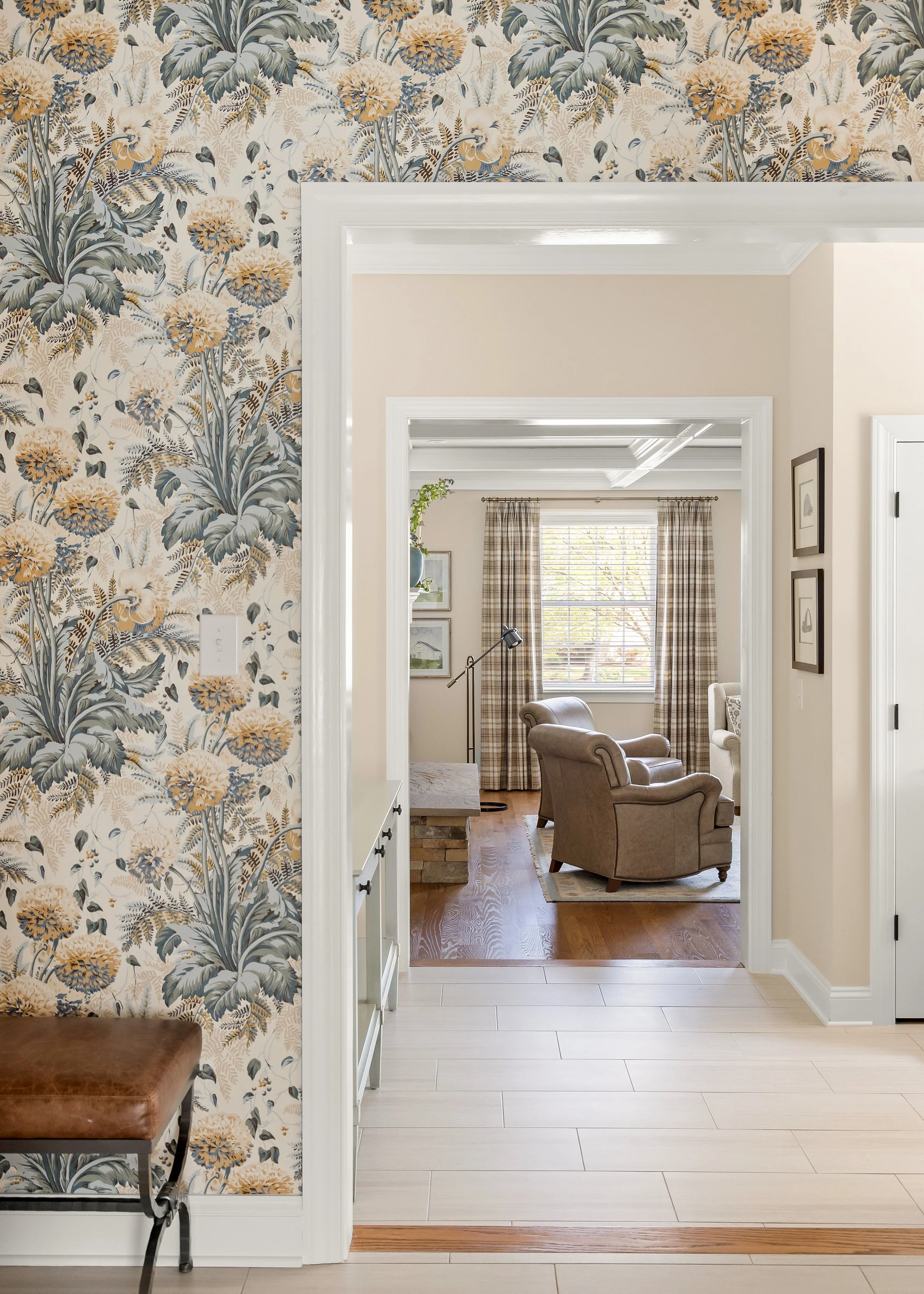
The wallpaper I selected for the middle hall, which frames the vista of the family room from the kitchen, reflects the vintage style of the old family farm. This pattern made my client think of the flowers that grew in the garden and around the farm generally and it is one of the details that her guests most often compliment.
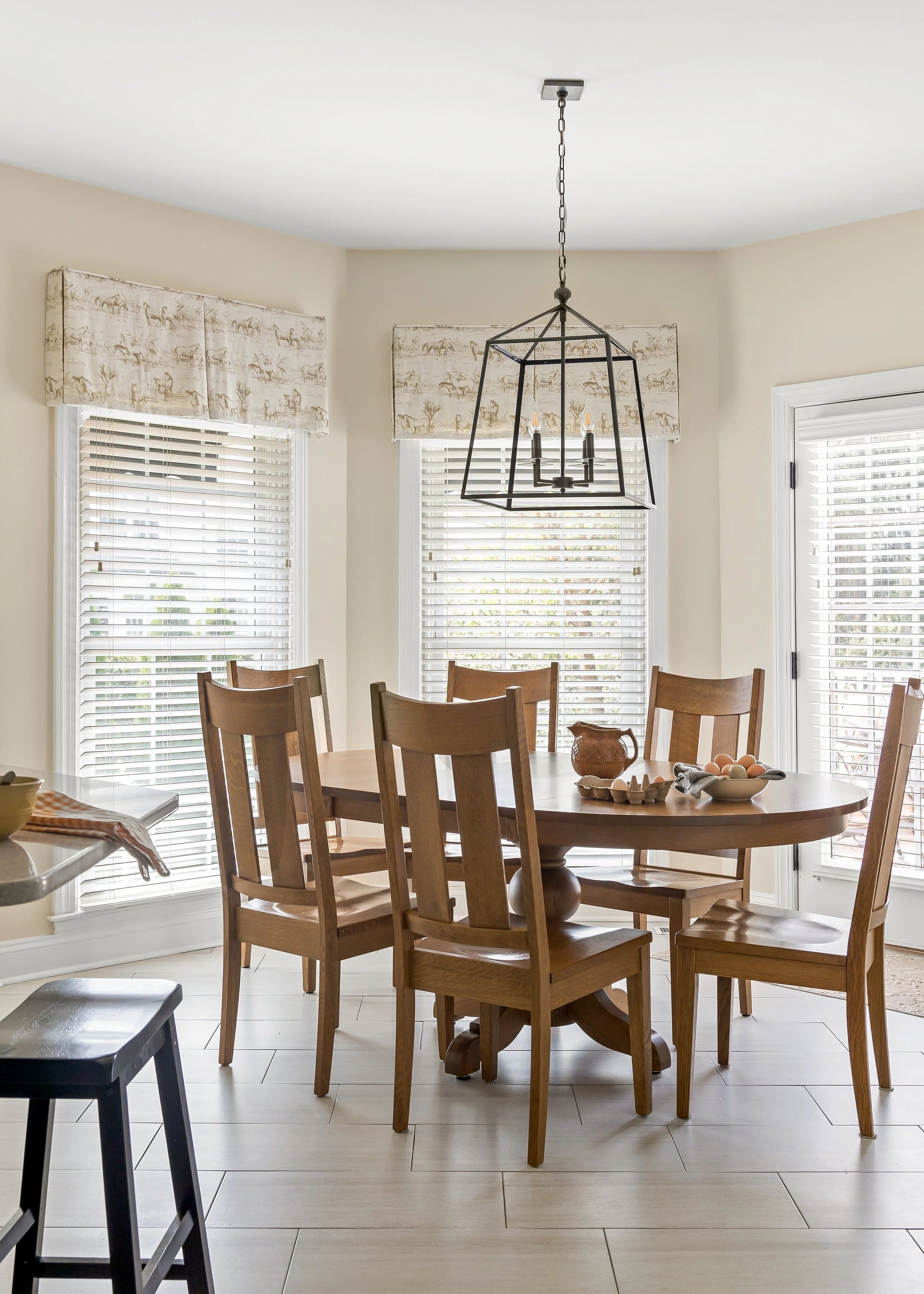
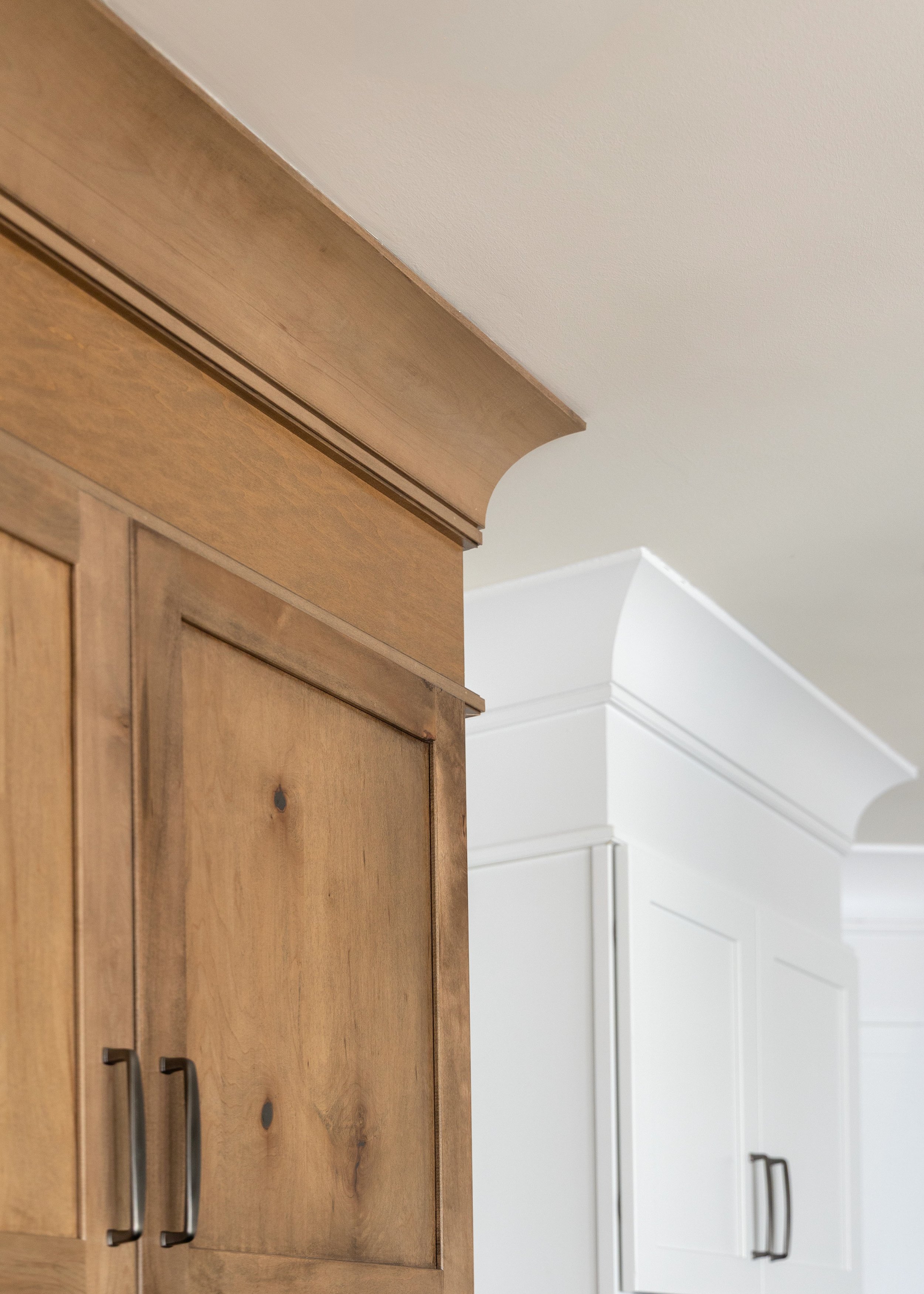
In the kitchen, the use of contrast is evident in the mix of cabinet finishes. Alder on the lower and refrigerator cabinets offers rustic knots, subtle grain and a honey glow. The white painted finish on the upper units prevents the hub of the work area from feeling dark or heavy. Contrast applies to style influences, too, and the pendants over the peninsula are an example of this, their silhouette lending a touch of modernism to the traditional design.
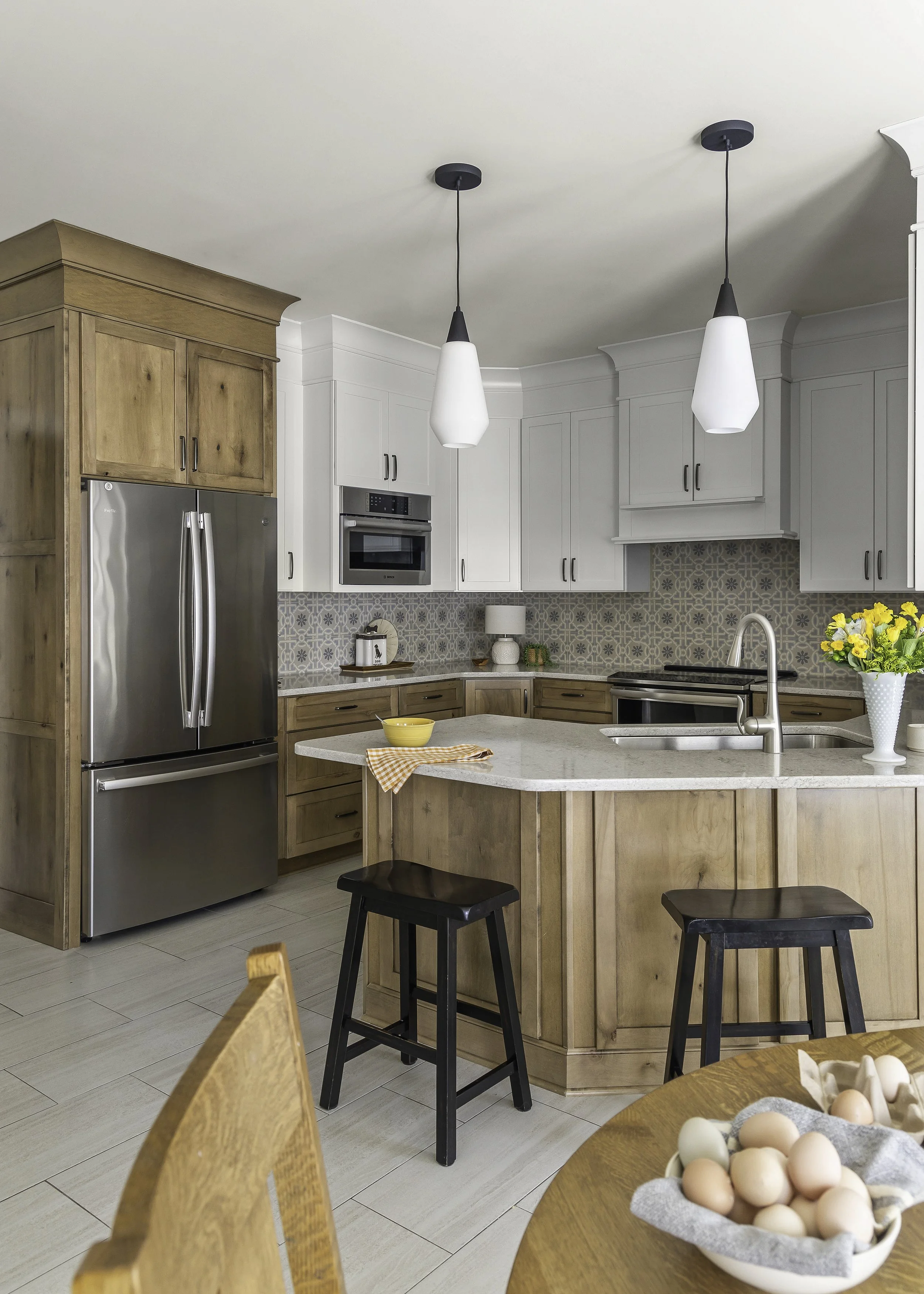
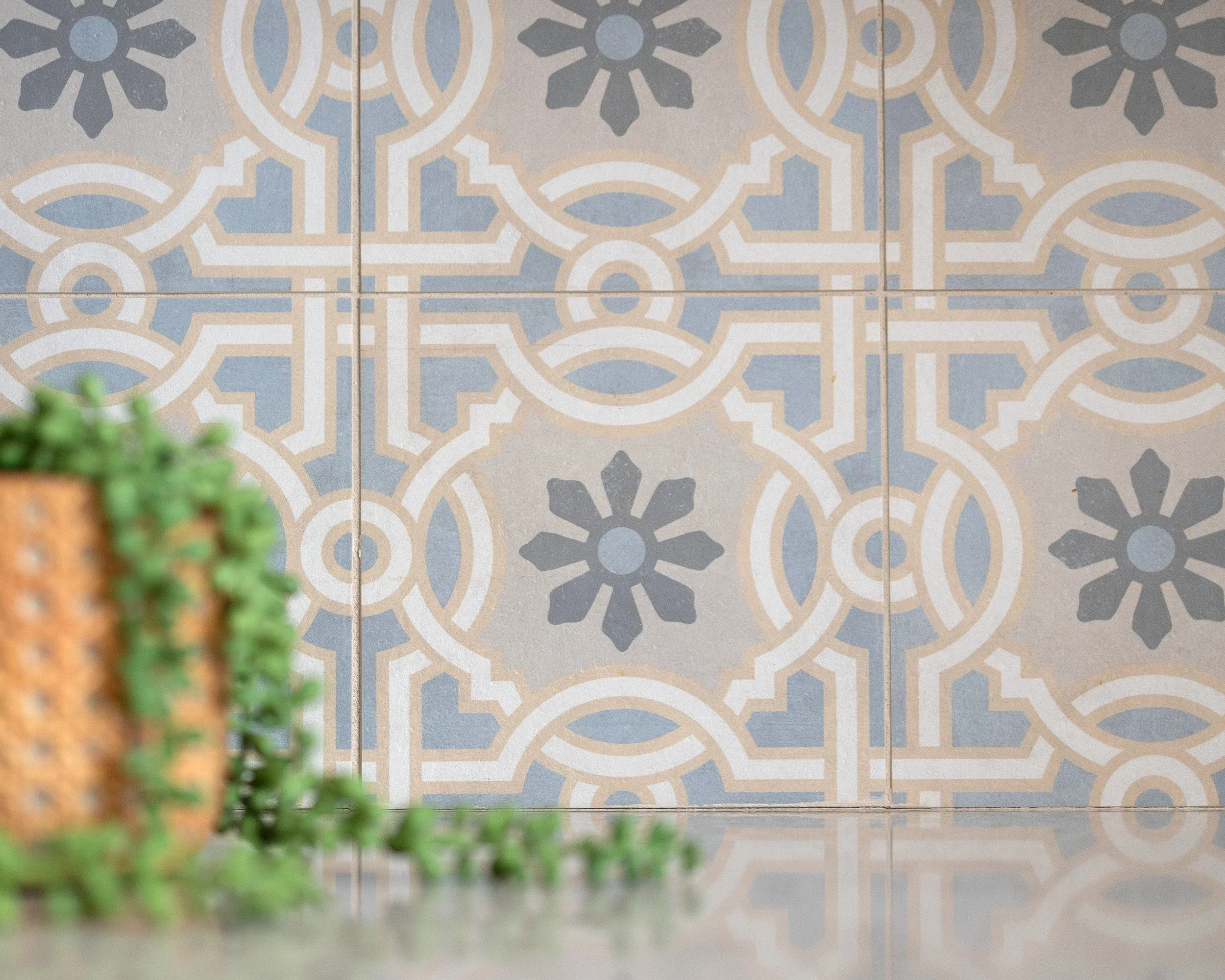
I selected a printed backsplash tile with colors that are reflected in the family room fabrics and elsewhere in the home. The pattern brings to mind the intricate piecework of quilts, a staple of cozy country (and urban) homes, new and old.
Luxury Architectural Details
For a room that has timeless appeal, there is nothing quite so satisfying as custom millwork. In this space, my design for the wainscoting above the mantel shelf and on the flanking walls eschews the plain Shaker influences that have been dominant in design until recently. The stone I selected for the hearth offers additional warmth. I specified the clean lines of an ashlar cut for the stone and the rustic elegance of drystack masonry.

On the ceiling, I repeated a coffered design that my client and I had added to another room a few years ago. The ceiling is painted in Benjamin Moore’s Abalone for added definition. My chandelier choice in antique brass and bronze has that clean, yet posh look that one would expect to see in a stylish, modern club house.
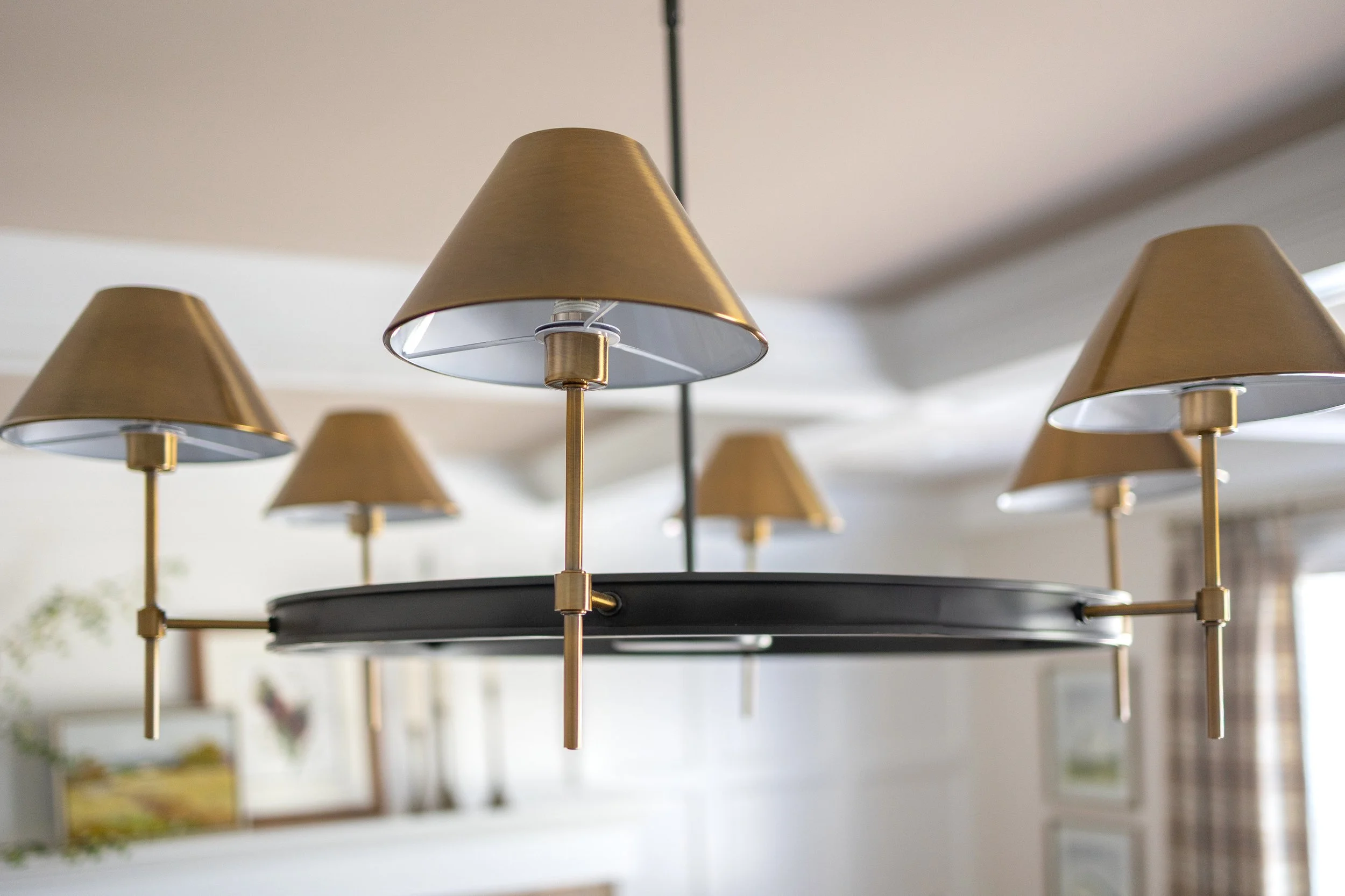
In the kitchen, the lighting is finished in black for a more rustic look, although the silhouette of the chandelier is reminiscent of the coach lamps that were ubiquitous in country house designs in the last century. While the kitchen itself is not large, we used stout, coved molding profiles on the upper cabinets for added polish. These millwork choices are key to creating an elevated design.
Thoughtful Styling
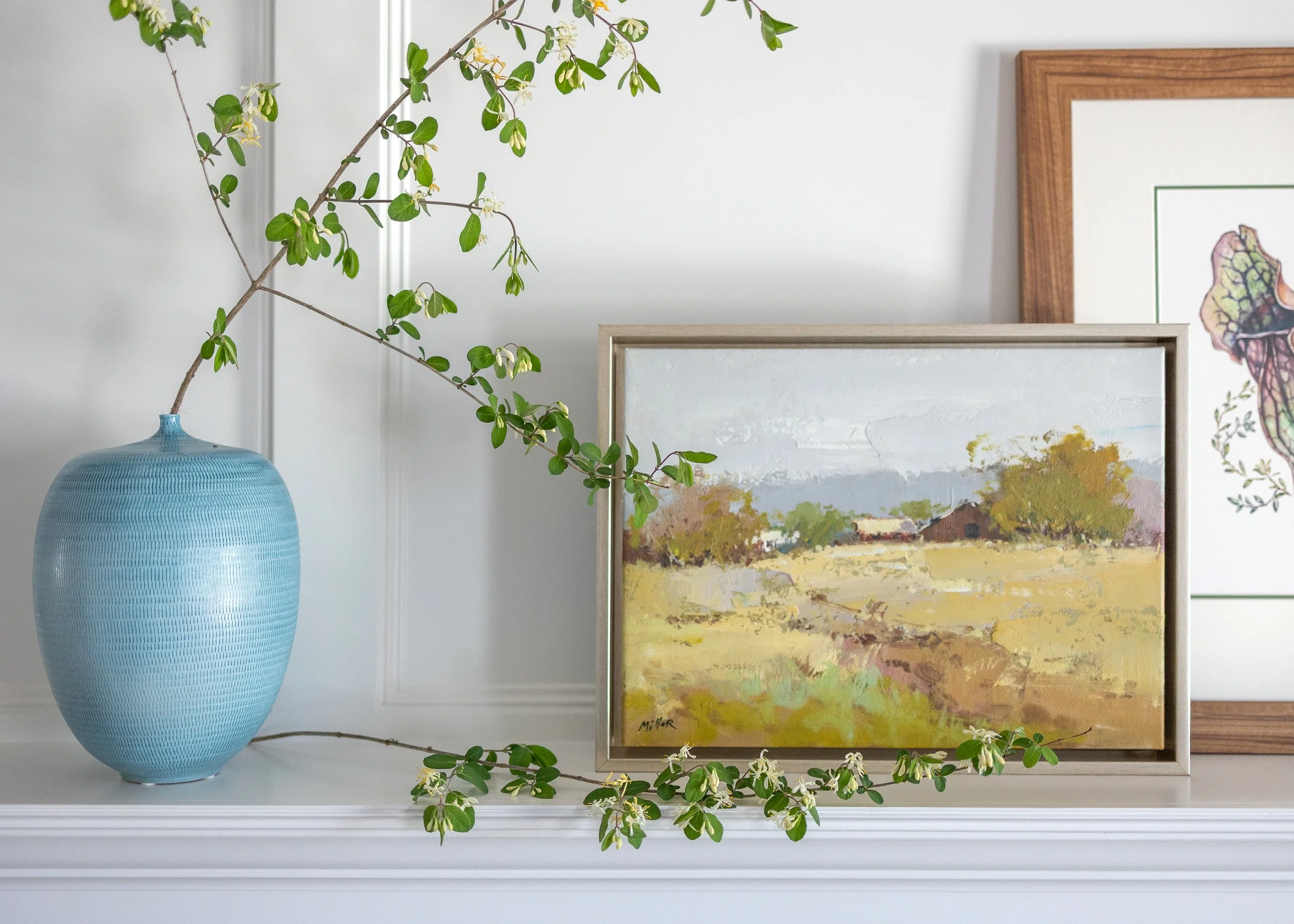
On the mantel shelf, the collection is arranged in artful layers. Fresh-cut tendrils of spring blooms reference the rugged beauty of farmland. The elements are placed asymmetrically to avoid the stiff formality that could all too easily take shape with traditional symmetry. The small painting of a farm here was the inspiration for the custom, large-scale painting that hangs above one of the sofas in the living room, created from photographs of the family farm.
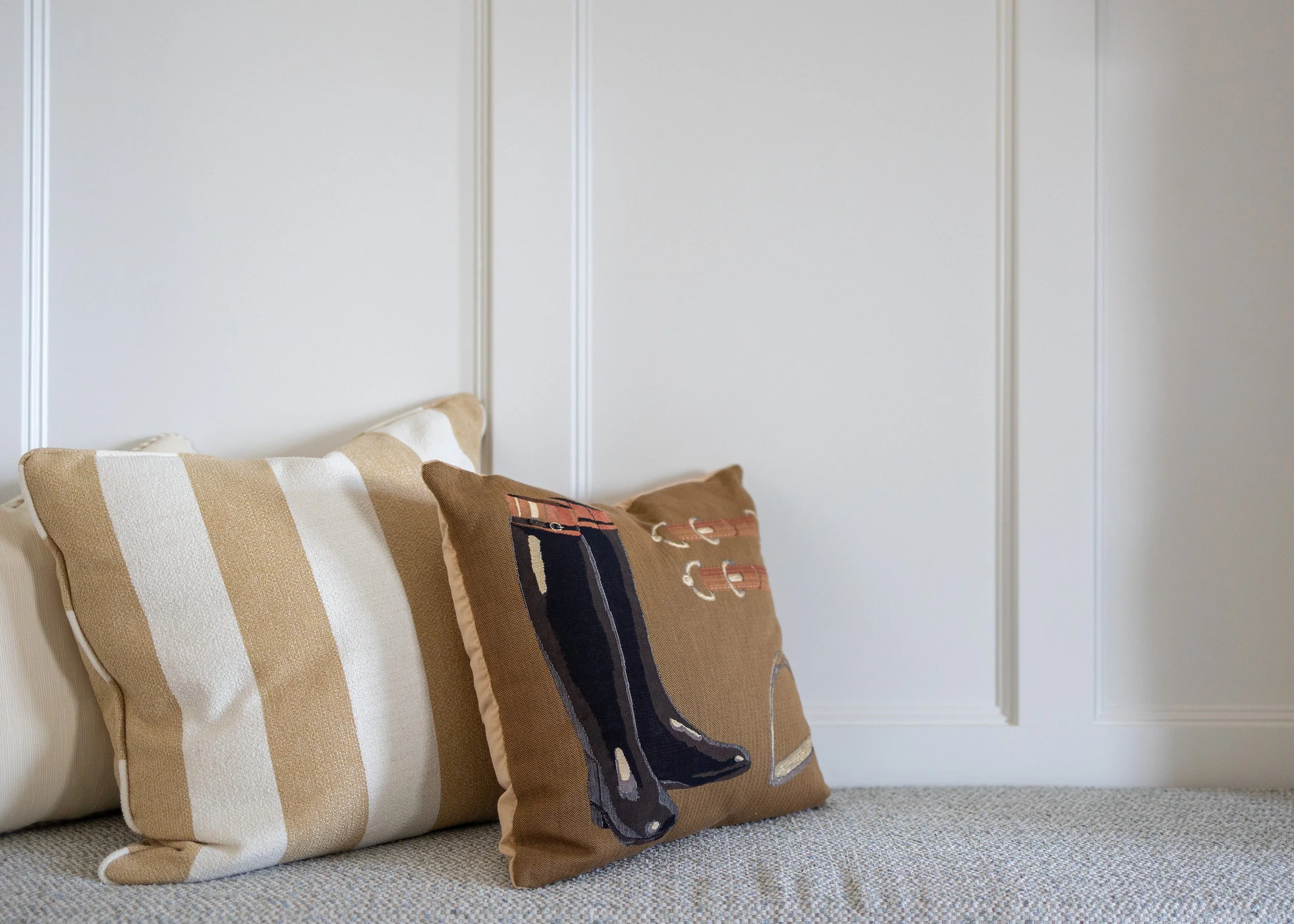
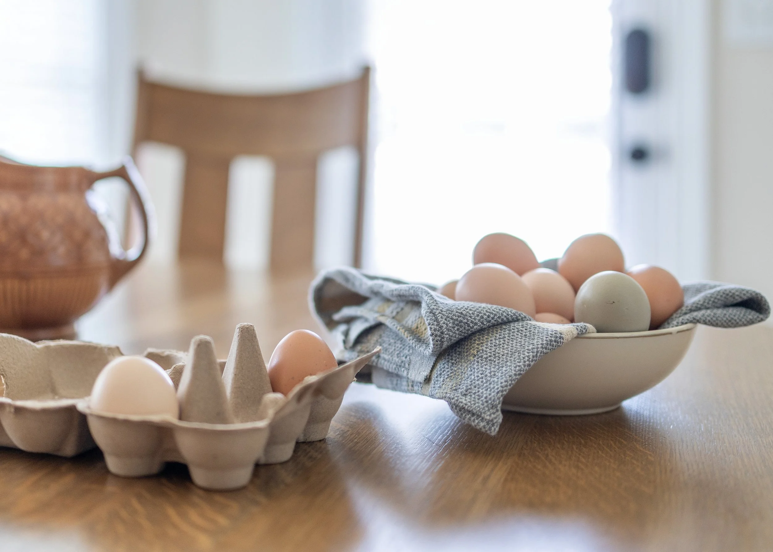
On the living room bench seats, which flank the hearth, an accent pillow with riding boots is a cheeky nod to our style inspiration. In the kitchen, there is evidence of a continuation of this family’s heritage, with fresh eggs from the farm that my client’s daughter owns not far away. These references, the sustaining gifts of the land, are not merely an aesthetic choice, but a reflection of the past and the future for this client.
Interested in seeing how design can transform your home? Get started.
After Photos: Matthew Lofton
Before

A designer’s every choice is intentional, mindful of scale and proportion, rhythm and harmony, contrast and texture. Our ‘Why We Did That’ series is a bite-sized dive into one-off changes, big and small, that are part of our home transformations.
Interested in learning how we can bring change to your nest? Give our studio a call at 540-336-3385 or hit the button below to tell us more about your project.